My tools for design are  

myCafe application

Problem Overview

MyCafé coffee shop had been considering some improvements to adopt a dynamic approach in serving their customers.
The Café customers are mostly college students. The Café can get really busy at certain times so the wait time for ordering would be long.
This problem can lead many students to either get their coffee somewhere else or totally dismiss ordering from MyCafé.
Research & Analysis

I started my research by focusing on the users needs in terms of how often they go to a Café to get a cup of coffee and what would make their experience even more enjoyable.
Extracted data from a semi-structured interview with variety of users suggested that 80 percent of the participants go to coffee shop on a regular basis.
My research also revealed that 100% of the customers are students who use mobile apps regularly.

Design: Concepts & Sketching

Data showed that the transaction and ordering process seemed to have some glitches.
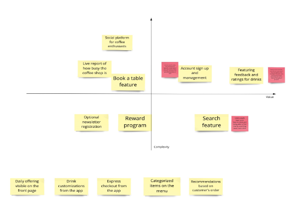
I started ideation around design of a mobile app that is linked to the café’s offerings. Some of the ideas were dropped at the early stage in feature prioritization process.
After value vs. complexity evaluation, I decided to design an app that helps customers find their cup of drink and place their order for pick-up at MyCafé

Value vs. complexity
Value Vs. complexity chart
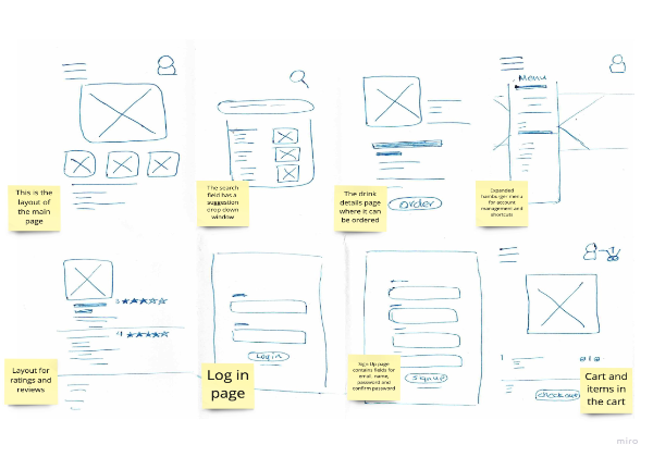
Picture of Sketch
Crazy 8 Sketch

Develop: Prototyping

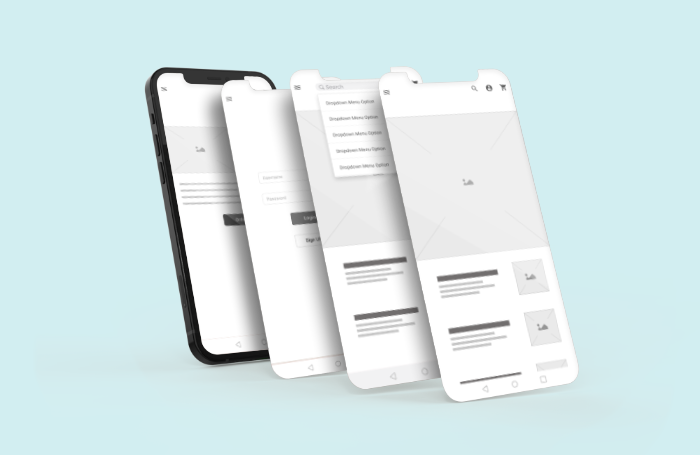
Lo-Fi

Next step was designing a Low Fidelity prototype so I can layout sketches to visualize how everything fit together on the screen. In the Lo-Fi prototype, my goal was to transfer the main concepts from the sketch to the screen. Navigation through a search feature and adding items into the shopping cart were the areas of focus.
I added a touch of personalization by considering account signup and login.

Value vs. complexity

Develop: Prototyping

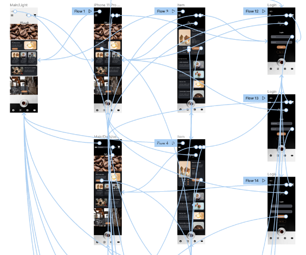
Hi-Fi

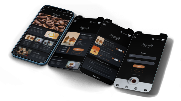
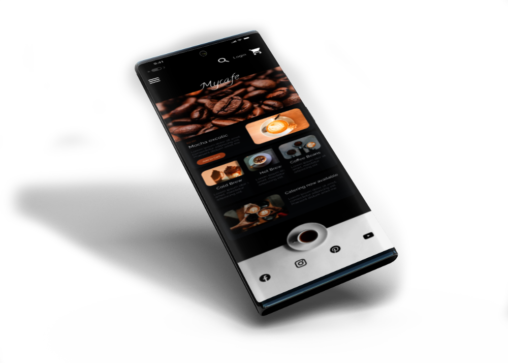
At Hi-Fi prototype, all the visual elements and styles such as typography, colors, UI elements, icons and images were prepared using Figma. A pattern library also was developed to use as a reference across the entire project. It was time to get the prototype tested by real users. I made sure to emphasize the design on the core features so I can see the feedbacks more clearly.

Value vs. complexity

Test: Validation, Usability, Feedback

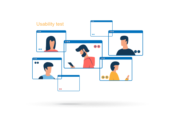
I invited 10 participants to test the Hi-Fi prototype via lookback.
I asked them to complete a few tasks such as Search for a drink and simply complete the order process or Login to their imaginary account The results were as follows:

  • 80 percent of participants were able to spot the search feature easily
  • 50 percent of participants were distracted by item suggestions at the checkout page
  • All participants were able to successfully complete the login user journey
  • Button sizes needed improvements

Value vs. complexity

Design: Iteration

After testing MyCafé prototype with the real users, I began to iterate the design based on the targeted KPIs (Key Performance Indicator).
For instance I realized that the search feature needs a more clear visual design to decrease time on task. Some icons and text colors needed to change to comply with the WCAG standards. At the final stage I completed all the changes and prepared all necessary design information for the engineering handoff.

Value vs. complexity

Link to Annotated Iteration

Solution & Impact Overview

The solution of design and development of a mobile app for MyCafé is highly beneficial on different levels.

  • Customers of MyCafé can take advantage of using the app to browse, choose and order their cup of coffee quickly and efficiently.
  • The app can also benefit the Café in terms of attracting more customers and help the staff with having a more organized work flow.

Value vs. complexity

Link to Hi-Fi Prototype